Table of Contents
Pacific EMIS Data Warehouse
This is the user guide to using the Pacific EMIS Data Warehouse for powerful and flexible data analysis. The data warehouse is a collection of SQL tables and views that the user can connect to using Excel or other Analysis or Statistics software and conduct further analysis on the data. It can be useful to to ad-hoc reporting, custom reports, advanced research all using a single source of truth of high quality data.
Accessing the Data Warehouse with Excel
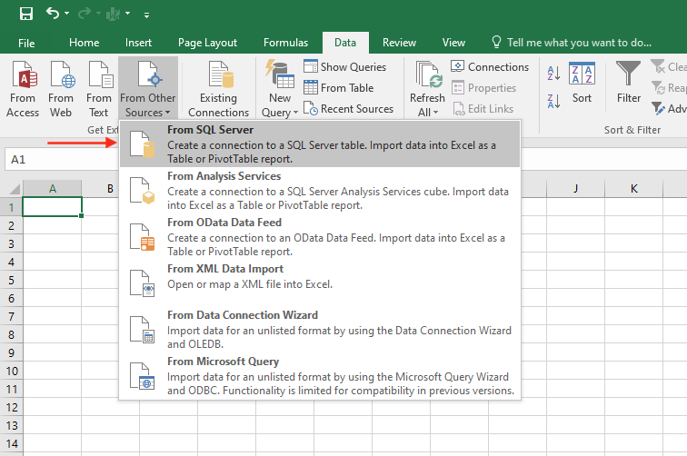
The tool the most commonly used by people is typically Excel. Here is how to connect to the data warehouse using Excel. Click on Data → From Other Sources as shown below
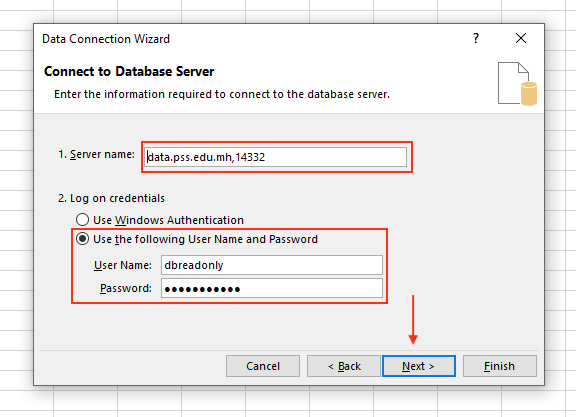
Enter the information to connect to your EMIS. The server address could be something like “fedemis.doe.fm” or “data.pss.edu.mh,14332” (if you are not on a default SQL Server port). Then enter the credentials. All EMISes should have a dbreadonly user provided to you by your data staff along with a password.
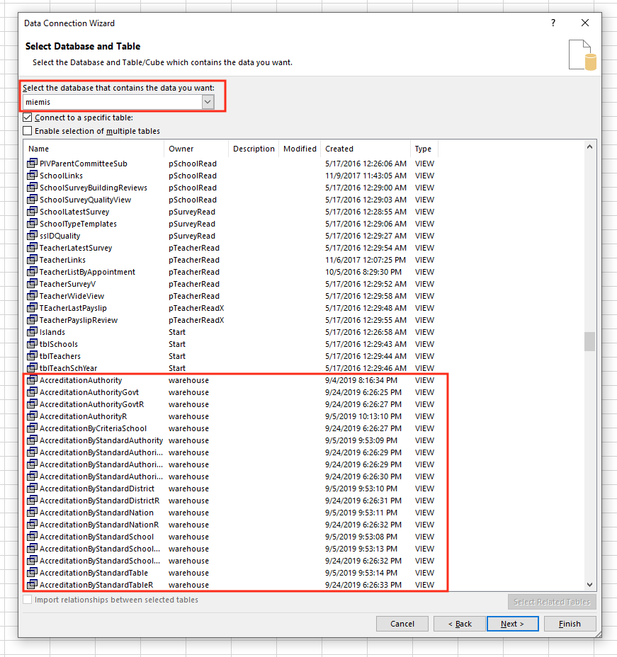
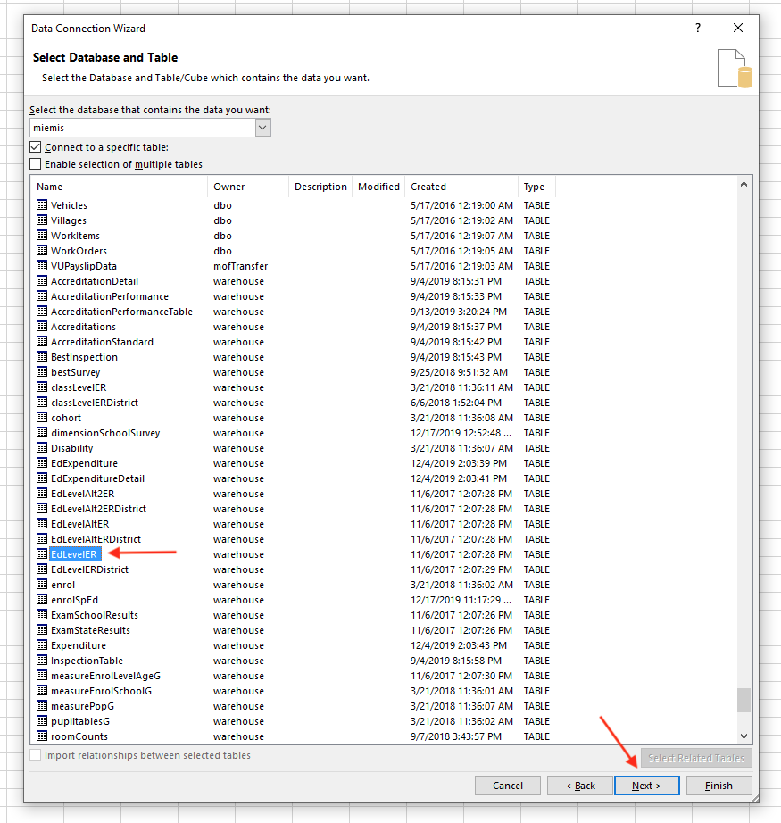
In the next step, make sure you select the correct database (e.g. fedemis, miemis, etc.) as there could be other databases on the server you are connecting to. You will see all views and tables of the database. Focus on the ones with owner “warehouse” as outlined below.
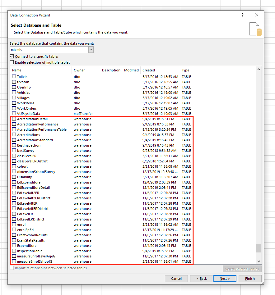
Similarly, the tables with owner “warehouse” more near the bottom of the list.
Let's select the EdLevelER table as shown below as example.
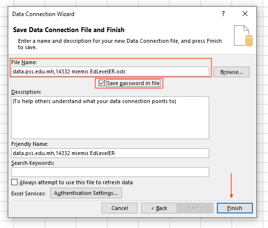
You then need to give the connection a name and feel free to save the password since this is a read only user. Then click on Finish.
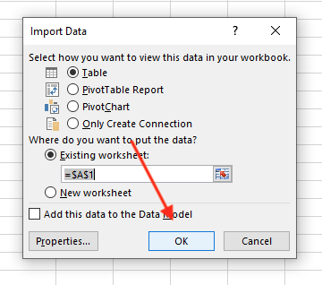
Finally, decide how you want to import the data. The default is fine to learn. Then Click Ok.
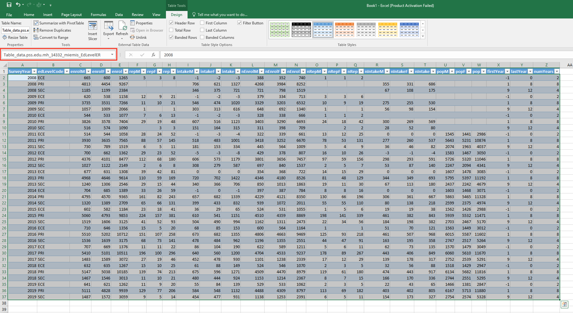
It will then load the table into Excel for you to further analyse. The whole data table can be reference from the dropdown as outlined below in red and you can rename that to your liking which becomes handy if you start pulling yourself many tables and views.
Notes on documentation of Tables and Views below
There are many tables and views in the data warehouse. Some are more for advanced data analysts, database administrators and developers. Some or more for data managers, IT staff and even management staff. Two types of notes will be used throughout the tables and views documentation below.
Notes on School Aggregations
The Pacific EMIS and therefore the data warehouse offers a very wide range of possible disaggregation. In particular there is one group of disaggregation they will repeatedly come back. Any data that is available by school will also automatically be available to aggregate by all the following:
- Local Electorate (Ward in RMI, Region/District/Electoral Division/Zone in FSM, )
- National Electorate (Constituency in RMI, State in FSM,
- District (Atoll / Island in RMI, State in FSM, Province in Solomon Islands)
- Island (Island/Municipality in FSM)
- Region
- Authority
- Authority Type
- Authority Group (School Type in RMI/FSM)
- School Type (School Level in RMI/FSM)
So if you are in RMI and want to do an aggregation by what you know as Atoll and Island you would use the data in the District column and aggregate on that. It can be renamed in your own excel or word report and is already renamed for you in the web app and PDF reports.
Note on database and data terminology
When working with data it is hard to avoid technical terminologies completely. Even as a data analysis it will be important to learn some database terminology.
One such important concept is “normalized” vs “denormalized”. Let's explain this in a simple way as these terms are used throughout the following sections while explaining the data in the data warehouse.
Let's use the following example to demonstrate this. We can say that this data is normalized by Gender since there is a Gender column and the gender data itself is also in the rows of data.
| Year | Education Level | Gender | Enrolments |
|---|---|---|---|
| 2013 | ECE | Female | 909 |
| 2013 | PRI | Female | 8985 |
| 2013 | SEC | Female | 3383 |
| 2013 | ECE | Male | 1028 |
| 2013 | PRI | Male | 9610 |
| 2013 | SEC | Male | 3505 |
But the same data could be expressed in another way, by having the data denormalized by Gender. In this following case we have less rows of data and the Male vs Female is expressed with two new columns.
| Year | Education Level | Enrolment Males | Enrolment Females |
|---|---|---|---|
| 2013 | ECE | 1028 | 909 |
| 2013 | PRI | 9610 | 8985 |
| 2013 | SEC | 3505 | 3383 |
In what way the data is expressed often depends on what the user wants to do with it and with what tools. Typically, analysis tools such as Excel pivot tables you would be better off to have it normalized giving you more flexibility in your analysis. You will find data in both format in the warehouse giving advanced users more choice and flexibility.
Data Warehouse Tables and Views
This section provides first minimum of technical background and then detailed information about the data warehouse. Each tables and views are discussed (i.e. what data can be found inside), provides some useful tips on how it could be used and often provides a sample excel workbook with example analysis.
The following subsection are organized by type of data supported by the EMIS (i.e. Enrolments, Flows, Special Education, School Accreditation, etc.) and not in the order in which they come in the warehouse itself.
Enrolments
The following tables and views provides enrolments data in various aggregations.
View warehouse.EnrolSchoolDimension
A view that provides enrollments, repeaters, transfers in, transfers out, boarders, students with disability, dropouts, pre-school attenders totals and all the available schools disaggregation, Class Level, Age and Gender.
A sample workbook how this table can be pulled in excel and analysis done in the data is included below.
Table warehouse.EdLevelER
This is similar to the data above in that it contains enrollment data. However, the data is packaged with different aggregations targeted at computing some of the most common key indicators (i.e. NER, GER). In this table we have enrollments, repeaters, intakes and population with the ability to disaggregate by gender and education levels (i.e. ECE, Primary, Secondary).
Details about the columns names in this table are included below:
- SurveyYEar: school year of survey to collect data
- ClassLevel: the class level or grade
- YearOfEd: the official year of education of the class level
- OfficialAge: the official age of the class level
- enrolM: males enrolled
- enrolF: females enrolled
- enrol: total enrolled
- repM: male repeaters
- repF: female repeaters
- rep: total repeaters
- psaM: male pre-school attenders
- psaF: female pre-school attenders
- psa: total pre-school attenders
- intakeM: males intakes (new enrollments without repeaters)
- intakeF: females intakes (new enrollments without repeaters)
- intake: total intakes (new enrollments without repeaters)
- nEnrolM: males enrolled of official age
- nEnrolF: females enrolled of official age
- nEnrol: total enrolled of official age
- nIntakeM: males intakes of official age
- nIntakeF: females intakes of official age
- nIntake: total intakes of official age
- nRepM: male repeaters of official age
- nRepF: female repeaters of official age
- nRep: total repeaters of official age
- popM: male population as per most recent population projection in use
- popF: female population as per most recent population projection in use
- pop: total population as per most recent population projection in use
The workbook below shows some sample analysis. This workbook does a bit more than simple pivot tables and charts on the data but also computes new data using formulas.
Table warehouse.ClassLevelER
This table is similar to the warehouse.EdLevelER above but instead of prodiving disaggregation by education levels it can disaggregate by class levels (i.e. Grade 1, Grade 2, etc.) which can then be used to produce some other key indicators (i.e. NIR, GIR)
Flows
Views warehouse.CohortNation, warehouse.CohortDistrict and warehouse.CohortSchool
The primary views to produce flow ratios indicators.
Each of these views produce the same data but with different disaggregations (i.e. down to school level, district level and nation wide and by gender). Each record will have the following data which must be used in various formulas to produce the final indicators. There is a bold emphasis on the most important ones to produce most flow indicators with enough precision. These flows use the reconstructed cohort methods and must have consistent collection of enrolments and repeaters for two consecutive years. Details about the columns names in this view are included below:
- Enrol: the enrolments (e.g. Grade 5 enrolments for 2018-19)
- Rep: the repeaters (e.g. Grade 5 repeaters for 2018-19. In other words, Grade 5 cohort of previous school year staying in Grade 5)
- RepNY: the repeaters for the next school year (e.g. Grade 5 repeaters for 2019-20.)
- TroutNY: the transfers out for the next school year (e.g. Grade 5 transfers out for 2019-20)
- EnrolNYNextLevel: the enrolments for the next school year into the next class level/grade (e.g. Grade 6 enrolments for 2019-20)
- RepNYNextLevel: the repeaters for the next school year into the next class level/grade (e.g. Grade 6 repeaters for 2019-20)
- TrinNYNextLevel: the transfers in for the next school year (e.g. Grade 6 transfers in for 2019-20)
The formulas are either identical or mathematical equivalent (or near equivalent) to the ones in the UNESCO UIS Education Indicators Technical guidelines.
- Promotion Rate $$= \frac{(EnrolNYNextLevel - RepNYNextLevel)}{Enrol}$$
- Repetition Rate $$= \frac{RepNY} {Enrol}$$
- Survival Rate (year on year; not to a particular year) $$= \frac{Promotion Rate}{( 1 - Repetition Rate)}$$ which also $$= \frac{\frac{(EnrolNYNextLevel - RepNYNextLevel)}{Enrol}}{( 1 - \frac{RepNY}{Enrol})}$$ which also $$= \frac{EnrolNYNextLevel - RepNYNextLevel}{Enrol - RepNY}$$
- Dropout Rate = $$1 - (Promotion Rate + Repetition Rate)$$
A sample workbook showing how these many flow indicators can be calculated including some analysis is included below.
Teachers
Table warehouse.TeacherLocation
The table warehouse.TeacherLocation sits on the transition between:
- teacher reporting derived from the School Surveys (i.e. PDF annual surveys, Excel Workbook); and
- teacher reporting derived from Appointments, and teacher training records from the web UI (i.e. manual entry of records in UI).
Regardless of the setup, this table brings these two sets of data together. There is a record for each teacher for each year they were active. It contains the gender, DoB, age group of teacher, the school, role, source (i.e. an appointment or reported through survey), whether the teacher is qualified and certified as determined by any possible means, the education sector, the max ISCED level taught, which grades taught, and some other details.
Tables/Views warehouse.TeacherJob*
Tables containing data about the number of staff and their job title, staff type (i.e. teaching and non-teaching) and teacher type (i.e. regular, special ed.). They come in various disaggregations:
- warehouse.TeacherJobTable
- warehouse.TeacherJobSchool
- warehouse.TeacherJobDistrict
- warehouse.TeacherJobAuthority
- warehouse.TeacherJobAuthorityGovt
- warehouse.TeacherJobRegion
- warehouse.TeacherJobIsland
- warehouse.TeacherJobNation
- warehouse.TeacherJobSchoolType
Tables/Views warehouse.TeacherActivity*
Tables containing data about the number of staff teaching at specific grades. They come with various disaggregations support.
- warehouse.TeacherActivityTable
- warehouse.TeacherActivitySchool
- warehouse.TeacherActivityDistrict
- warehouse.TeacherActivityAuthority
- warehouse.TeacherActivityAuthorityGovt
- warehouse.TeacherActivityRegion
- warehouse.TeacherActivityIsland
- warehouse.TeacherActivityNation
- warehouse.TeacherActivitySchoolType
They are generally used to produce Pupil-Teacher Ratios (PTR) with higher accuracy. The PTR = Enrol / Teachers. The warehouse tables provide the following columns:
- Enrol: enrolments for the grade (and whatever other disggregation)
- Staff: total teachers teaching at that grade (regardless of how much time in a day they teach there)
- StaffW: teachers full time equivalent teaching at that grade
- GradePTR: the PTR calculated without regards for full time equivalent
- GradePTRW: more precise PTR calculated with StaffW (i.e. full time equivalent)
A sample workbook on teacher data analysis is included below.
Special Education
Table warehouse.enrolSpEd
This is the foundation for special education student data. It can be used directly and supports the highest flexibility and disaggregation power. Mainly this can go down to the individual school level and therefore all its possible disaggregations. More precisely it can disaggregate data by:
- School
- Education Level
- Class level (grades)
- Gender
- Age
- Authority
- District
- AuthorityGovt
- SchoolType
- Region
- Ethnicity
- SpEd Environment
- Disability
- English Learner
View warehouse.SpecialEd
Similar to table.enrolSpEd above but it does not disaggregate down to the School level, only by
- Education Level
- Gender
- Age
- Authority
- District
- AuthorityGovt
- SchoolType
- Region
- Ethnicity
- SpEd Environment
- Disability
- English Learner
Use this view for higher level statistics about special education data across any of the above. For example of how to use this warehouse view refer to the same file attached in warehouse.enrolSpEd
The following analysis workbook makes use of all the above tables and views and provides some examples of analysis that can be done with the data.
School Accreditation
View warehouse.Accreditation[Aggregation]
Many views are essentially the same but offering different aggregations. For example,
- warehouse.AccreditationAuthority
- warehouse.AccreditationAuthorityGovt
- warehouse.AccreditationAuthorityGovt
- warehouse.AccreditationDistrict
- warehouse.AccreditationNation
- warehouse.AccreditationSchool
All offer the same data but doing the analysis by authority, authority government (public/private), district (Atolls, State, Provinces) and down by individual schools. The data enables analysis at a highest level (i.e. the accreditation status (i.e. Level 1, Level 2, Level 3, Level 4). The example workbook below does some analysis by nation, district (Atolls, State, Provinces) and historical.
View warehouse.AccreditationByStandard[Aggregation]
All the views starting with “AccreditationByStandard” are essentially the same but offering different aggregations. For example,
- warehouse.AccreditationByStandardAuthority
- warehouse.AccreditationByStandardAuthorityGovt
- warehouse.AccreditationByStandardDistrict
- warehouse.AccreditationByStandardNation
- warehouse.AccreditationByStandardSchool
- warehouse.AccreditationByStandardTable
All offer the same data but doing the analysis by authority, authority government (public/private), district (Atolls, State, Provinces) and down by individual schools. The data enables analysis at the standard level (i.e. the number of schools that achieve a specific level (i.e. Level 1, Level 2, Level 3, Level 4) for each of the individual school evaluation standards and classroom observations. The example workbook below does some analysis by nation and district (Atolls, State, Provinces).
View warehouse.AccreditationClassic
This view is designed to provide a familiar data format for FSM/RMI. It is similar to the table warehouse.Accreditations but already links with bestSurvey and dimensionSchoolSurvey to provide users everything in a single “table”. With this view users can pull all data for school accreditation like it was in the classic school accreditation analysis spreadsheet, but with the added benefit of more consistent data from the EMIS, historical analysis (not before possible), and more powerful aggregations.
View warehouse.AccreditationPivot
This view is designed for pivot table use to provide maximum analysis flexibility. It supports:
- disaggregation by school or key school attributes
- calculation of percentages and 'nominal' Level at standard and criteria level
- analysis of results by sub-criteria
- disaggregation by overall inspection result
- time series
TODO sample spreadsheet
Advanced Data Warehouse Tables and Views
This section provides details on the remaining tables and views and only recommended reading for the most advanced data analysts and even software developers contributing to this project. The following sub-sections are organized like the previous section but contain the remaining tables most data managers will not require to use directly.
Enrolments
Table warehouse.enrol
Lowest level table in warehouse holding enrolment related data. This covers the “enrolment” data collection in survey forms:
- enrol
- repeaters
- transfers in
- transfers out
- boarders
- disability (aggregated)
- dropouts
- preschool attenders (aggregated)
The data is normalized by Gender, separates Estimates and Actuals. The table warehouse.tableEnrol aggregates this data up to District, Authority, SchoolTypeCode and is used as the basis for higher level aggregations of any of these enrolment data items.
Table warehouse.tableEnrol
Same of warehouse.enrol except this table aggregates this data up to District, Authority, SchoolTypeCode and is used as the basis for higher level aggregations of any of these enrolment data items.
Teachers
Table warehouse.TeacherQual
Intermediate table to assist in calculation of Certified / Qualified. This table shows, for each teacher, the qualifications reported, and the first year of that report. It is assembled from both the School Surveys, and any named qualifications reported in the web UI.
Special Education
School Accreditation
Table warehouse.AccreditationDetail
This is one of the core tables to make up the Data Warehouse's School Accreditation data.
View warehouse.AccreditationPerformance
by inspID and rank, shows those criteria scoring in that rank. e.g. the data looks like
| InspID | Rank | [SE.1.1] | [SE.1.1_Count] |
|---|---|---|---|
| 9876 | 2 | 2 | 1 |
ie: the count column is 1 when the corresponding criteria score equals the Rank of that record. the score column is the criteria score when that score equals the Rank of that record
View warehouse.AccreditationStandard
by inspId and Standard, the calculated Result for that standard.
Table warehouse.Accreditations
This is one of the core tables to make up the Data Warehouse's School Accreditation data.
This is the denormalized view of all the school accreditations by criteria similar to how the excel spreadsheets was organized in the legacy School Accreditation excel workbook analysis tool before the EMIS was used to manage the data.
Table warehouse.StandardTable
Consolidates each standard by result level.
Table warehouse.PerformanceTable
Consolidates performance data
Inspections
Table warehouse.InspectionTable
Consolidates the overall result of inspections with all the typical school disaggregations. Filter on InspectionType to restrict to specific inspections (e.g. School Accreditation, WASH, etc.)
View warehouse.InspectionDistrict
View warehouse.InspectionAuthority
Special Tables
Some tables are “special” in the sense that they don't hold the core data about something but they hold some other important information such as the best possible survey available for each school, the best latest (or best) school inspection. They provide a number of powerful tools to “complete” your data and make it of higher quality. Those tables will be discussed here.
Table warehouse.BestInspection
This table shows, for each survey year, school and inspection type the most recent matching inspection up to that year. This allows aggregations across inspections without duplicating a school. Also makes possible cumulative time-lines on inspections which normally would not necessarily happen every year for every school.
Aggregated tables, then views are built on these foundations. Using SurveyDimensionId from warehouse.BestSurvey allows us to retrieve aggregation dimensions (i.e. District, Authority, etc.) for each school. Use warehouse.BestInspection to ensure that a school represented nomore than once in any aggregation.
Views warehouse.AnyViewNameEndingwithR
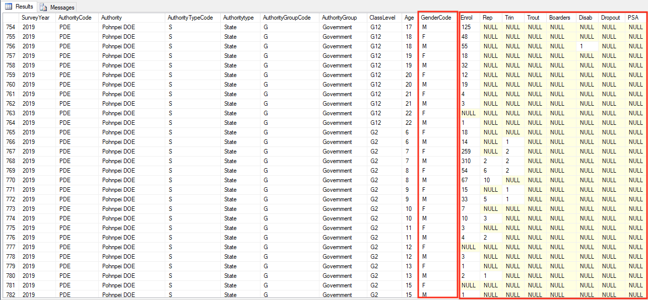
There are many views that end with the letter “R”. Those are the same as their counterpart view/table but denormalized also by gender (or some other useful denormalization.) For example, let's look at the view warehouse.EnrolAuthority. It looks like the following. The gender data is normalized, meaning it is in the rows (and not in the columns).
There is another counterpart view that is essentially the same data. The view is called warehouse.EnrolAuthorityR (same as above but with added “R” at the end. It looks like the following image. Note how the gender is now in the column instead of in the rows.
